Since Googles landmark announcement that they will only show ‘mobile-friendly’ websites in their search results for mobile devices, we have had a number of clients (old and new) contact us to upgrade their site to a mobile-friendly option, yet when they get their estimate, we talk about building them a responsive website. What is this and are they getting what they asked for? The simple answer is yes, but you’re getting so much more. Here’s why…
What is the difference between a mobile-friendly, mobile optimised and a responsive website?
Mobile-friendly website
- Initially a mobile-friendly website referred to a website that could be viewed on a mobile device. Essentially, a site that didn’t have Flash plug-ins that prevent them from displaying on a tablet or smartphone.
- This is the old style website that we know from the past. They are the exact version of the desktop – just condensed to visually fit onto the screen.
- They require you to zoom in to read content or to click on links, so are not very user-friendly.
- Ironically, due to Googles new Mobile-Friendly Test, this terminology is no longer correct for this static type of website which should be converted to a Mobile Optimised Website or preferably a Responsive Designed Website.
Mobile optimised website
- A mobile website is a similar version of the website that you see on your desktop – but is not exactly the same in regards to the amount of pages or the domain name.
- It is designed specifically to be used on smartphone devices and requires a separate domain to display. An “auto-detect” will notify the website that a smartphone user is trying to view it and will automatically point the visitor to the mobile version. This can be seen when the letter ‘m’ appears before your domain name.
- Often the mobile friendly website has a limited number of the pages from the desktop version. This can have a negative result on your SEO and dilute your stats as what you see on your desktop cannot all be seen on the phone.
- Getting a mobile website created is a cost effective option as it doesn’t include everything from your desktop site. But over time, you will more likely want to convert to a responsive site as it won’t return the same amount of results as your desktop will.
- You can include a link on the mobile site that directs your viewer to your desktop site so that visitors can find more information, but that then becomes difficult to read and click on links as the text becomes smaller to allow the website to fit on your screen.
- A mobile site will register on Googles ‘Mobile-Friendly Test’ as being mobile friendly. It will pass the test but won’t be best practice.
Responsive designed website
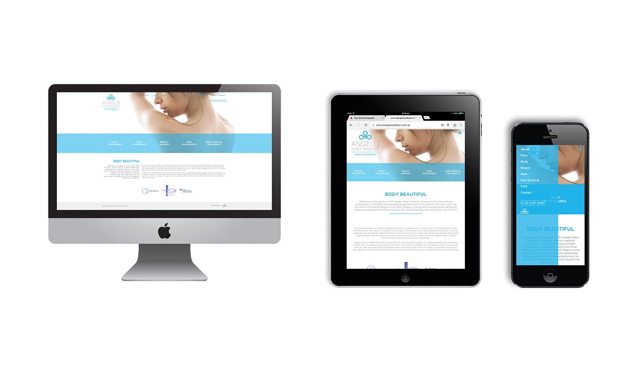
- A responsive website is designed to resize on desktops, tablets and phones. Essentially, three different designs.
- A responsive site will automatically re-orientate, reformat and re-optimise the design based on the size of the device screen.
- The key elements include designs that allow for more legible text and easy to click buttons for the small devices. User ability is a big element to a responsive website.
- Instead of being a separate version of your desktop website (as with a mobile friendly website), a responsive site is exactly the same content as your desktop, with the same amount of pages – they just readjust to the size of the screen – one website for multiple devices.
- Responsive websites are the best option for SEO, as your one site is viewed on multiple devices instead of being directed to an ‘m’ URL.
- More importantly, Google recommends using responsive design when building mobile-friendly websites.
- Responsive websites provide the added benefit of a consistent brand experience across devices with the same content, images and calls to action.
- To test if your site is responsive, hop onto your desktop version. Grab the bottom left corner of the screen and drag it in and out. At certain sizes, your website will change to a new layout, until you go down to the smallest size (which would be your smartphone). If it doesn’t resize you most likely have a static site.
With the unprecedented amount of mobile traffic to websites these days, we highly recommend to all of our clients to convert their sites to be responsive. Give our team a call on 0481 846 481.
Written by branding specialist Debbie O’Connor
Consultant, Strategist, Keynote Speaker