The psychology of colour covers 6 key principles that relate to the use of colour in branding and design.
Colour plays a powerful role in shaping our perceptions and emotions. It is an important element to consider the psychology of colour when it comes to branding and design.
1. Different colours evoke different emotions
Different colours are associated with different emotions and meanings. For example, red is often associated with passion, excitement or danger. Think about how a person feels when offered a single stem or massive bouquet of red roses? Or if they are confronted with a big red ‘danger; or keep out sign. Green on the other hand has a more calming effect on emotions. This is why a lot of hospitals or community centres have their walls painted in pale green. When comparing how red makes you feel compared to green, think about the emotion of a red traffic light compared to a green traffic light., while blue is often associated with calm and trust.
2. Colour can influence behaviour:
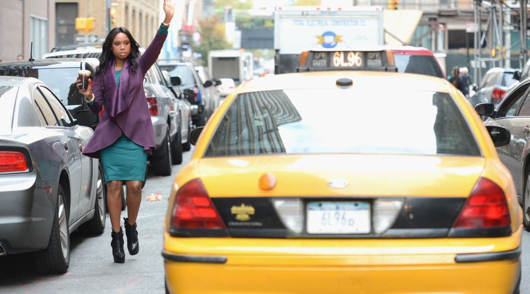
The colours used in a design can influence behaviour and decision-making. For example, yellow is often used to grab attention, such as the yellow cab’s in New York or to indicate a sale or bargain. On the other hand black is often used to make something look expensive or sophisticated, ensuring that it has a level of prestige or premium price that people are willing to pay due to the perceived value.
3. Colour can convey different messages:
Different colours can convey different messages and meanings. For example, blue is often associated with trust, honesty and authority (depending on how deep the blue is), while orange is often associated with friendliness, energy and vibrancy.
4. Colour can impact perceptions of quality:
The colours used in a design can impact perceptions of quality and value. For example, a luxury brand might use more expensive and sophisticated colours like gold and silver, while a budget brand might use more affordable and playful colours like yellow and pink.

5. Colour can affect memory and recall:
The colours used in a design can impact memory and recall. One perfect example is if a person is given a Robbin’s-egg blue box or gift bag. Immediately they may associate it with Tiffany and expect a very special gift inside. A brand might use bright and bold colours to make their products more memorable, while a calming and soothing colour palette might be used to create a relaxing atmosphere.
6. Colour can be culturally significant:
The meanings and associations of different colours can vary across cultures. It’s important to consider cultural differences when choosing colours for branding and design, as certain colours may have different meanings in different parts of the world. White in the Western world represents purity and innocence while in Asian cultures it represents death. As you can see, if you get your colour choice wrong in regards to your audience, you can create a massive disconnect with your audience. Learn more about the meaning of colour in culture.
In conclusion, the psychology of colour is a complex and multifaceted topic, and the meanings and associations of different colours can vary depending on the context in which they are used. By understanding these psychological principles, businesses can effectively use colour in branding and design to evoke specific emotions and convey specific messages to their audience.