Understanding Colour Profiles
Our regular clients have become accustomed to us spurting abbreviations such as CMYK, RGB and PMS. But for most business owners who don’t have design or printing skills this is merely tech talk and goes right over their heads.
This article will hopefully help explain what we are on about. The abbreviations above, all stand for different colour processes.

CMYK and Printing
CMYK stands for the four colour plates that make up the base from which full colour printing is obtained. C = Cyan, M = Magenta, Y = Yellow and K = Black. The letter B is not used for black as it is already used in the RGB (Red, Green, Blue) abbreviation.
The four-colour printing process uses four printing plates. When the colours are combined on paper (they are actually printed as small dots), the human eye sees the final image. As with your primary colours (that you learnt as a child);
yellow + cyan (blue) = green
cyan + magenta (red) = purple
yellow + magenta (red) = orange and so on.
Different ink coverage from each plate creates an illusion for the eye to perceive millions of different colours, hues and tones.
CMYK and Designing
As graphic designers, we have to deal with the issue of our clients seeing our work on screen in RGB, although our final printed product will be in CMYK. In the print-ready process we need to convert all digital files to CMYK before sending to printers. Due to the difference in screen colours and printed colours, we often use the “Pantone Matching System,” or PMS colours if exact colour matching is important.

The Pantone Matching System (PMS)
The Pantone colours (also known as PMS or spot colours) have an industry standard book of thousands of colour swatches with reference numbers that we can identify them with and give to the printer. Most corporate colours in a logo for example, are identified with a number from this system. These are premixed inks that match these numbers. This is similar to picking paint at the hardware store to paint your walls: You refer to swatches, choose by number and then the colour is pre-mixed before application.
Pantone swatches provide us with a printed example of what a colour will look like on paper and give us a CMYK equivalent to work from (especially when having to print a full colour project such as a brochure or catalogue). Even though the on-screen colour won’t exactly match the swatch, we know what our final colour will look like. If colour is an important aspect of your brand you can always request a “proof” which is an example of your printed work provided before the entire job is run. The Pantone system creates the most accurate colour match and the sharpest details. This type of printing is not used as much anymore as full colour process (CMYK) has become more affordable with the advance in technology.
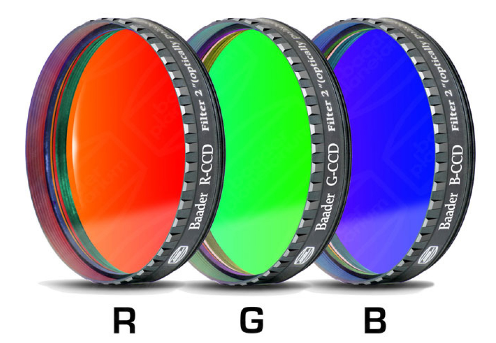
RGB – Screen Colours
RGB is the colour model for computer monitors, video, etc (made up of red, green and blue) and is what you will view your projects in while still on screen. Without going into the science, it is critical to understand that PMS and CMYK are for printed pieces and RGB is for computer applications such as web sites and will almost always view differently.
Web Safe colours are a sub-set of 216 RGB colours that most accurately display on monitors with a very limited spectrum of colours. These days, most computer monitors have better video cards and higher resolution and can view more than this limited palette. However there are still some web-based design code that prefers these colours.
Finally, it’s important to note that while these are called “safe”, that does NOT mean a colour will look the same from one monitor to the next. Variability with screen brightness, lighting conditions, and hue & contrast settings will render the exact same colour differently from one computer monitor to the next. It is also very important to note that colours that are viewed on a monitor will look very different on a printed page. This is why it is essential to ensure that you are aware of what type of files you are supplying to your designer and what colour format they are in.