Branding
Creative Ideas
Graphic Design
Marketing
Websites
Brand Personality
Social Media
Walk down memory lane
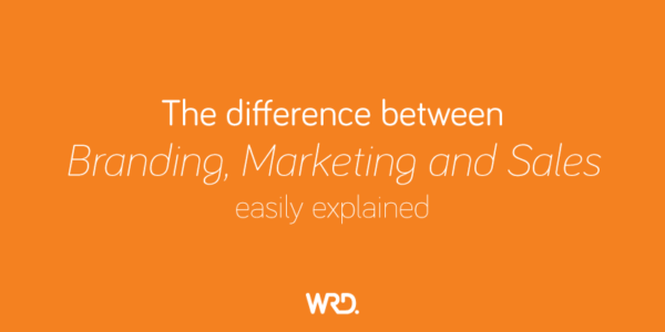
Are you confused about the difference between branding, marketing and sales? We demystify this for you...
Branding
Creative Ideas
Graphic Design
Marketing
Websites
Brand Personality
Social Media
Walk down memory lane
A carefully crafted brand that has undergone remarkable evolution.
Branding
Creative Ideas
Graphic Design
Marketing
Websites
Brand Personality
Social Media
Walk down memory lane
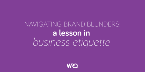
One wrong step can lead to a brand blunder that reverberates through social media channels
Branding
Creative Ideas
Graphic Design
Marketing
Websites
Brand Personality
Social Media
Walk down memory lane
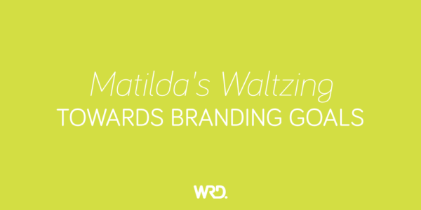
The Matilda's have cemented themselves as a beloved Australian brand, but they haven't waltzed into that position.
Branding
Creative Ideas
Graphic Design
Marketing
Websites
Brand Personality
Social Media
Walk down memory lane
Lego has always been about creating something new and unique.
Branding
Creative Ideas
Graphic Design
Marketing
Websites
Brand Personality
Social Media
Walk down memory lane
Just like emails and the internet, AI is here to stay, so lets see how we can make it work for us.
Branding
Creative Ideas
Graphic Design
Marketing
Websites
Brand Personality
Social Media
Walk down memory lane
Why do a lot of hospitals or community centres have their walls painted in pale green?
Branding
Creative Ideas
Graphic Design
Marketing
Websites
Brand Personality
Social Media
Walk down memory lane
We won't lie, the lockdown took a toll on us.
Branding
Creative Ideas
Graphic Design
Marketing
Websites
Brand Personality
Social Media
Walk down memory lane
We were hoping for a slightly quieter year with less stress - we certainly go part of that wish.